多年来,搜客来不忘初心,以建立行业服务标杆为目标,不断提升技术和设计服务水平,帮助客户建立互联网品牌形象、优化传播渠道、精准锁定目标客户。 搜客来主营服务有:高端网站建设、公众号开发、小程序开发、APP开发、网站排名优化。我们以客户的成功为最高的荣耀,我们为客户创造价值从而实现自身价值!

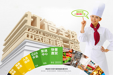
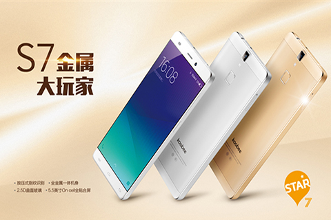
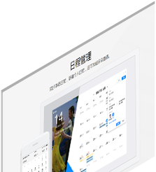
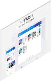
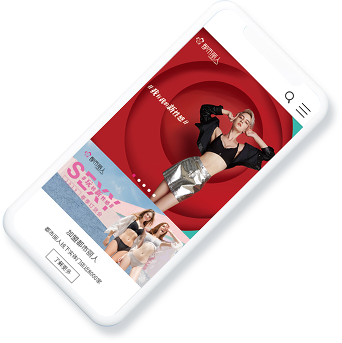
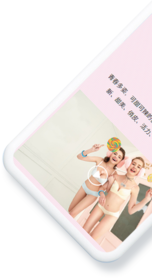
营销型.响应式网站,全网跨屏,无缝对接目标群体!
让我们的服务,帮助您的品牌更有效率的传播!
MORE


MORE


一站式服务,与项目经理对接超省心
MORE


多年来,搜客来不忘初心,以建立行业服务标杆为目标,不断提升技术和设计服务水平,帮助客户建立互联网品牌形象、优化传播渠道、精准锁定目标客户。 搜客来主营服务有:高端网站建设、公众号开发、小程序开发、APP开发、网站排名优化。我们以客户的成功为最高的荣耀,我们为客户创造价值从而实现自身价值!

12年互联网品牌建设与传播经验
20余人项目策划及网站设计团队
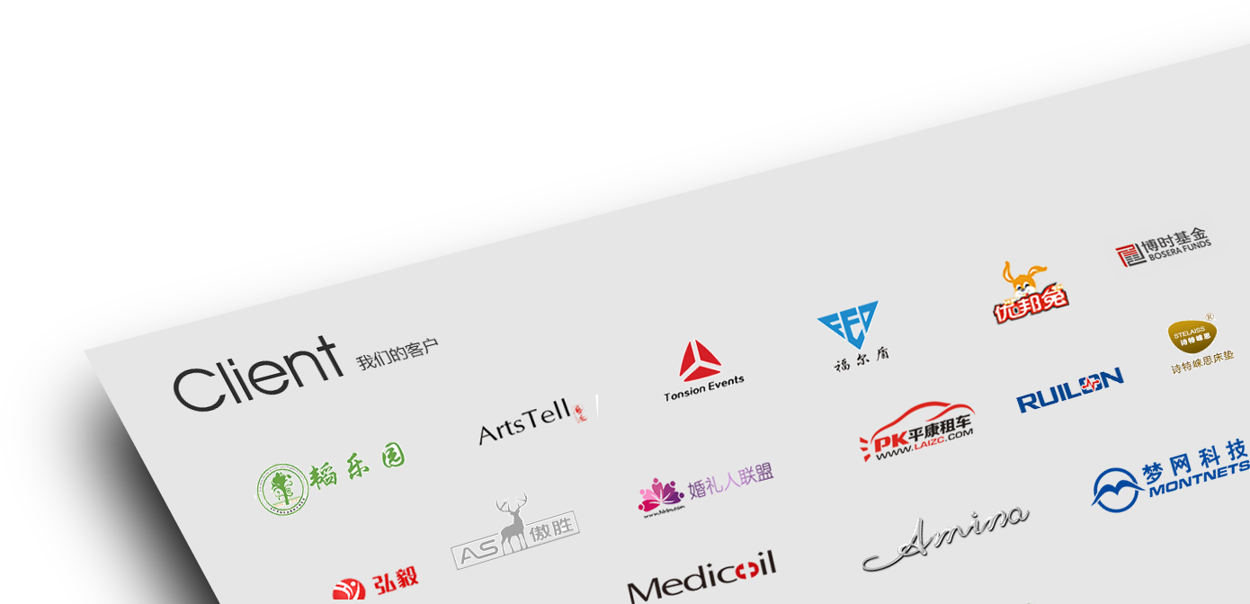
6000余家客户的选择与认可
100%站内深度优化
25个检测标准
12道内部标准执行流程
地址:深圳市南山区蛇口公园南路10号. 南山互联网创新创意服务基地一期三楼A302
邮箱:admin@soukelai99.com
Copyright © 2018 深圳网站建设公司搜客来 粤ICP备15012135号


